What your Team Should Do in Round 2 of the 2020 NFL Draft

Matthew Colón (mcolon21@stanford.edu)

The 2020 NFL Draft has finally arrived. Three jam-packed days full of excitement and new opportunities as we watch the top collegiate talent ascend into the professional ranks of the National Football League. Within the NFL front offices, however, there is a different tone: pressure to make the right choices, and a whole lot of uncertainty. Sure, years of college tape and the NFL Combine should, in theory, provide teams with sufficient information to make the right draft choices, but when you consider the fact that Tom Brady was drafted in the sixth round of the 2000 NFL Draft, and the Chicago Bears passed up on both Patrick Mahomes and DeShaun Watson to draft Mitch Trubisky in 2017, it becomes clear that drafting is still just as much an art as it is a science.

But how skillful are teams at drafting players? Well, it is likely that some general managers and coaches have a more keen eye for true talent than others, but that is not the focus of this analysis. Instead, I am interested in positional discrepancies. Is the league as a whole better at scouting, and thus drafting, talent at certain positions than others at different points of the draft? If this question is answered, it could go a long way toward optimizing drafting strategy by position for teams.

Data

For this analysis, I have used draft data and statistics from Pro Football Reference. More specifically, I have used draft data from thirty-three NFL Drafts (1967-1999), resulting in 11,078 drafted NFL players. More recent NFL Draft data was omitted due to the fact that the career value of players who are still active in the league cannot be accurately calculated until their retirement, yet omitting them completely while including others from their draft classes who have since retired would skew the dataset. Thus, 1999 was chosen as the most recent draft to use in the analysis due to the fact that it is the most recent draft from which all drafted players are now retired (Tom Brady, the oldest current drafted NFL player, was drafted in the 2000 NFL Draft).

Variable of Interest

The variable of interest that I have used for this analysis is Career Weighted Approximated Value, which has also been provided by Pro Football Reference. This statistic is a weighted sum of the Season Approximated Value statistics for a given player. The Season Approximated Value statistic puts a value on a player’s season based on a combination of player achievements and the divvying up of team achievements. For more information on this statistic, check out: https://www.sports-reference.com/blog/approximate-value-methodology/.

Specific Focus: What History Says about Drafting in the Second Round

The first round of the NFL draft came to a close last night. From looking at the Big Boards of experts, it appears as though plenty of talent remains at three key positions which are projected to be heavily drafted in tonight’s second round. Those positions are Running Back, Wide Receiver, and Defensive Back.

While Clyde Edwards-Helaire (LSU) was drafted at the end of the first round by the Kansas City Chiefs, he was the only Running Back off of the board in round one, which few experts had anticipated. Plenty of talent remains that could go a long way toward juicing up NFL backfields, including DeAndre Swift (Georgia), J.K. Dobbins (Ohio State), Jonathan Taylor (Wisconsin), Cam Akers (Florida State), Zack Moss (Utah), among others.

Conversely, six Wide Receivers were taken in the first round, but many analysts have called this Wide Receiver draft class the deepest ever, or at least the deepest since the 2014 class, which included the likes of Mike Evans, Odell Beckham Jr., Davante Adams, Brandon Cooks, and Allen Robinson. That means that there will be plenty of high-quality wideouts still available for Round 2, including Tee Higgins (Clemson), Laviska Shenault Jr. (Colorado), Michael Pittman Jr. (USC), Denzel Mims (Baylor), and K.J. Hamler (Penn State), among others.

As for defensive backs, while the top tier cornerbacks have already been selected, many safeties and other top-tier cornerbacks have fallen much further than anticipated, meaning Round 2 could provide many teams with an opportunity to strengthen their secondary. Safeties such as Xavier McKinney (Alabama), Grant Delpit (LSU), Antoine Winfield Jr. (Minnesota), and Ashtyn Davis (California) were all seen by many as first round talents who have slid outside of the first 32 picks, and cornerbacks such as Kristian Fulton (LSU), Trevon Diggs (Alabama), Jaylon Johnson (Utah), and Bryce Hall (Virginia) are all expected to hear their names called by the commissioner sooner rather than later.

With a high supply of talent at these three positions headed into the second round of the 2020 NFL Draft tonight, my question is this: if I represent a team that needs talent at all three of these positions, or if I represent a team looking for the best value of these three heavy-supply positions, which position should I select in Round 2?

Methodology

As I mentioned above, I am working with 33 NFL Drafts-worth of data. I broke down this data into eleven positional groups, those being: Quarterback, Running Back, Wide Receiver, Tight End, Center, Tackle, Guard, Defensive End, Defensive Tackle, Linebacker, Defensive Back. I consolidated positions where necessary (such as “Half Backs” and “Running Backs” both being referred to as “Running Backs”). Note that while this analysis is possible with all positional groups, I will solely focus on the positions of Running Back, Wide Receiver, and Defensive Back for the sake of this analysis.

Next, for each position group, I standardized the Career Approximated Value data for each player of that position group. For example, each Running Back was assigned a Career Approximated Value z-score based on the mean and standard deviation statistics of the Running Back distribution. The reason for standardizing the data is that I was worried that the Career Approximated Value statistic may unfairly weight specific positions over others. Since I am solely concerned about drafting the best player in terms of value, I wanted to put all positions on equal footing, and by standardizing by position, I was able to accomplish this.

After that, I focused in on just the players drafted in the “second round” at each of these positions. The reason why “second round” is in quotations is that due to the league expanding significantly since 1967, I did not actually look at solely second round picks. Instead, I looked at picks 33-64 in each draft, corresponding to what in today’s NFL would be the second round. After narrowing down to just the second round, my dataset contained 174 Defensive Backs, 131 Running Backs, and 121 Wide Receivers, which I deemed sufficient in sample size.

Next, looking at the distributions of players drafted in the “second round” at Defensive Back, Running Back, and Wide Receiver, I wanted to know whether or not the distribution of these three positions differed significantly. Here is a box plot of the positional z-score distributions:

A box plot is great, but it’s hard to tell if there is, in actuality, a significant difference between the position groups. While a t-test or an ANOVA test would do the trick in conditions of normally-distributed data, the issue here is that for most position groups, the data is heavily right-skewed, with few players with very high value, and many players with low value. To account for this, I decided to use the Kruskal-Wallis Rank Sum Test, which is a non-parametric method for testing whether samples originate from the same distribution. The key with this method is that it is non-parametric, meaning it does not assume a normal distribution of data.

When we run the Kruskal-Wallis Rank Sum Test, we find the following:

With a p-value of 0.01196, we are confident that we are able to reject the null hypothesis of these distributions originating from the same distribution and conclude that they are distinct distributions. Using the eye test of the box plot, we can see that the rating of these positions from highest to lowest Career Approximated Value appears to be:

  1. Defensive Back
  2. Running Back
  3. Wide Receiver

However, with a test comparing three distributions, it’s hard to know which distributions significantly differ from the others. Thus, let’s conduct this Kruskal-Wallis Rank Sum Test over all pairs.

First, between Defensive Backs and Running Backs:

The p-value of this test is 0.05251. From this, we can reasonably conclude a difference in the distributions between Defensive Backs and Running Backs if we were to use a more lenient 0.10 significance-level threshold, but aren’t completely confident, as the p-value falls almost directly on the commonly-used 0.05 threshold.

Second, let’s compare Defensive Backs and Wide Receivers:

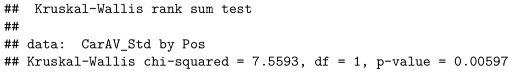
The p-value of this test is 0.00597. From this, we can say with much confidence that the distributions between Defensive Backs and Wide Receivers differ significantly. More specifically, the median Round 2 Defensive Back value is significantly greater than the median Round 2 Wide Receiver value.

Third, let’s compare Running Backs and Wide Receivers:

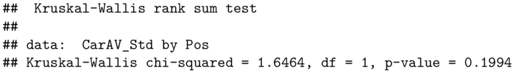
The p-value of this test is 0.1994. From this, we conclude that there is no difference between the distributions of Running Backs and Wide Receivers.

Historical NFL Draft Analysis: Looking Ahead to Round 2

Takeaways

After observing the box plot and completing multiple Kruskal-Wallis Rank Sum Tests, it can be concluded that Defensive Backs drafted in the second round of the NFL Draft have a higher Career Approximated Value than do Running Backs and Wide Receivers to a significant degree. Thus, if I represent a team that needs talent at all three of these positions, or if I represent a team looking for the highest player value, which is likely the case for several teams headed into the second round of the draft tonight, the best bet according to historical data appears to be to draft a Defensive Back.

In terms of a more broad takeaway, it appears as though teams are more effective at scouting Defensive Backs who are drafted in the second round than they are at scouting Running Backs or Wide Receivers. If this is the case, it makes sense to wait on drafting Running Backs and Wide Receivers if it is known that the scouting of Defensive Backs in the second round can be more heavily relied upon in terms of resulting in a quality player joining the team. Conversely, it is also possible that teams are not very skilled at scouting Defensive Backs in general, allowing highly skilled first-round-talent Defensive Backs to fall to Round 2. If this is the case, it makes sense to scoop up the top tier Defensive Backs in Round 2 that may have been mistakenly overlooked in Round 1.

Moving Forward

I believe that draft strategy remains a confusing art in the NFL today, and analyses like these could go a long way to analyzing what makes for an optimal drafting strategy. I hope to push forward with this analysis using data from other positions and other rounds with the hope of uncovering more significant trends that could help to inform draft strategy moving forward.

Economists Think MLB Pitchers Are Weird (Probably)

Silas Morsink (smorsink@stanford.edu)

A big thanks to Baseball Savant and Bill Petti for data provision and acquisition help.

You don’t need a background in economics to be familiar with the relationship between risk and reward. In life, riskier propositions are usually less attractive than their safer counterparts. Suppose you’ve come down with a cold: you’ll probably opt for your trusted DayQuil instead of taking a flyer on an untested remedy. But we don’t always opt for the safer option. Suppose I hand you a coin. If you choose to flip it, you’ll get $5 if it lands on heads, and $1000 if it lands on tails. If you choose not to flip at all, I’ll give you $10. Sure, the guaranteed $10 payout is “safer.” But I’m pretty sure you’ll flip the coin.

If faced with a risky option that has little reward (using the untested cold medicine), we’ll prefer the safer option with decent reward. But, we tend to like a risky option when the reward is high enough (flipping the coin).

What about when the reward on a safe option and a risky option is the same? Suppose we play the coin flip game again, but this time with different values. If you flip heads, you pay me $1000. If you flip tails, I pay you $1020. If you choose not to flip (the safe option), I’ll pay you $10. Either way, the expected value of the deal is $10. But, when expected rewards are the same, us risk averse humans tend to choose the safer option.

Economists formalize this relationship between risk and reward by analyzing the propositions that people tend to take on. There are lots of levels of complexity here, but we only need to focus on the most basic and most important conclusion: higher risk = higher reward. People tend to only take on higher risk propositions if their reward is higher. People can be convinced to take on lower reward propositions if the risk is lower.

If this doesn’t immediately make sense, consider the alternative. What if higher risk = lower reward? Hey: let’s play the coin flip game one more time. If you flip heads, you owe me $100. If you flip tails, I’ll give you $1. If you don’t flip at all, I’ll give you $5. You’d be crazy to flip the coin: it’s both riskier and lower reward.

Why This is Appearing at a Sports Analytics Blog

At this point, you would be justified in wondering what the hell this has to do with baseball. Well, we’re going to play the coin flip game with a pitcher. Except instead of choosing whether or not to flip a coin, he has to choose where to throw the ball.

Similarly to the coin flip game, there are riskier options and less risky pitch options. A pitch low and away? Low risk: the batter will almost certainly take the pitch for a ball; if they do swing, they are unlikely to make good contact. A pitch high in the middle of the strike zone? High risk: the batter might well swing and miss, but they also might barrel the ball over the fence. However, all the coin-flipping and medicine-choosing was meant to drive home the central lesson of risk and reward:  low risk is typically associated with low reward, and high risk is typically associated with high reward.

By this logic, the low risk pitch should have low reward, and the high risk pitch should have higher reward. Again, consider a world where this isn’t the case: where low risk pitches have high rewards, and high risk pitches have low rewards. Pitchers should virtually never throw the high risk, low reward pitches! It’s just like the last coin flip game: to throw the high risk, low reward pitch is to take the cold medicine that is both risky and ineffective.

What’s going on in the real world with MLB pitchers? Something weird. Here’s the spoiler: there’s often a negative relationship between risk and reward. There are some high risk, low reward pitch locations, and then there are some low risk, high reward pitch locations. And pitchers throw high risk, low reward pitches! They’re choosing the untested cold medicine: opting for low reward, high risk propositions. What’s going on here?

The Data

The idea of this project is to isolate the effect of pitch location. For various pitch locations, we want to obtain the distribution of outcomes associated with pitches to that location. If the economic theory holds (higher risk = higher reward), then the pitch locations with a higher expected outcome (reward) should also have a higher variance in outcomes (risk).

But first, we must address some complicating factors. Complicating factors (1) are things that affect the outcomes of pitches to a certain location and (2) differ across locations. Complicating factors may lead us to incorrect conclusions about pitch locations. For example, suppose that there are pitches that (1) are (for some reason other than location) associated with better outcomes, and (2) are more likely to be thrown to certain locations. Then, the locations to which these pitches are thrown would appear to have better outcomes due to the reason other than location.

The two complicating factors that I identified were pitch type and count. Pitch types (1) are associated with different outcomes: even if two pitches of different type are thrown to the same location, they’ll likely have different outcomes (owing to their movement, spin, etc: the pitch type). Plus, pitch types (2) differ across locations: for example, pitches high in the zone are disproportionately fastballs.

Count also fulfills the two criteria of a complicating factor. Count (1) affects the outcome of pitches to certain locations: for example, with two strikes, pitches to a given location tend to generate more swinging strikes and more ball-in-play outs. Also count (2) differs across location: unsurprisingly, pitchers are much less likely to throw a pitch out of the zone when there are three balls than when there are two strikes.

I directly controlled for these complicating factors by splitting the data by pitch type and count. What data? Statcast game logs from Baseball Savant from 2016 – July 2019, acquired through Bill Petti’s baseballr package. A big thanks to both of these awesome sources for making projects like this one accessible.

Some notes: obviously, pitchers sometimes (often) miss their location. To help address this, I defined “location” pretty generally: by splitting pitch locations into one-foot-by-one-foot buckets. And over a large sample, pitchers hit their locations on average. Also, there are other potential complicating factors. For example, having runners on base might affect pitch location: pitchers may be less willing to throw balls in the dirt with runners on. Future work in this area might consider batter handedness as well.

Weirdness on Four-Seam Fastballs: A Glimpse

After breaking the data down by count and pitch type, I looked specifically at four-seam fastballs, the most frequent pitch type in the data. (Perhaps other pitch types display different behavior, but even if that were not the case, the fact that fastball locations have a weird risk-reward relationship is notable). Pitches were grouped by truncating their horizontal and vertical locations: for example, one pitch location included all four-seamers from 1 foot above the ground to 1.99 feet above the ground, and from 1 foot right of center to 1.99 feet right of center. For each location, I obtained a distribution of outcomes by assigning a wOBA value to each pitch. For contacted pitches, I used the estimated wOBA from the exit velocity and launch angle of the batted ball. For non-contacted pitches, I used the count-specific wOBA value of a ball (if it was a ball) or the count-specific wOBA value of a strike (if it was a strike). Though I won’t go into details here, an excellent primer on wOBA from Fangraphs can be found here, this MLB.com glossary entry provides background on expected wOBA (what I used for contacted pitches), and this Hardball Times article provides an introduction to the count-specific value of a ball/strike. 

So, given a pitch type (four-seamers) and a count, I acquired the distribution of outcomes resulting from pitches to each location. Here are the important features of each location’s outcome distribution for our purposes: the mean (the reward of throwing a pitch to that location), and the standard deviation (the riskiness of throwing a pitch to that location). The theory says that if a pitch-location outcome distribution has a high mean, it should be a high-standard-deviation distribution too (high risk = high reward).

Let’s look at some results. Consider four-seamers thrown on 0-0 counts. Here is a plot of pitch locations: the color represents the expected outcome (reward) of a pitch to that location (the lighter the blue, the better the mean outcome).

Rplot

This is relatively intuitive: pitches up and middle have the worst outcomes, pitches away from the middle of the zone have better outcomes. Now, here’s the same plot of pitch locations. But this time, the coloring represents the standard deviation (risk) of throwing a pitch to each location (lighter blue = higher risk). If theory holds (higher risk = higher reward), we expect to see a similar picture: the locations of high reward should also be the locations of high risk.

Rplot01

Wait a second. This picture was supposed to be the same as the picture above, but instead it’s the inverse. The locations of high reward (light blue in the first picture) also tend to be the locations of low risk (dark blue in the second picture). The opposite is true too: in these pictures, low reward = high risk. Economic theory (anthropomorphized) is not happy.

Weirdness on Four-Seam Fastballs: More Evidence

Instead of eyeballing the intensity of various hues of blue, we can analyze the risk-reward relationship more rigorously. The following shows a linear regression, displaying the relationship between risk (on the horizontal axis) and reward (on the vertical axis) for 0-0 four seamers. The trend is the weird negative trend noted above: as risk increases, reward decreases.

Rplot02

This clearly illustrates the puzzling negative relationship between risk and reward. If there exist low-risk, high-reward pitch locations, why don’t pitchers throw to those locations all the time? In fact, it’s not just that they don’t throw to those locations all the time, it’s that they rarely do. Here is the same plot as the one above, with the size of each dot representing the number of pitches to that location. You’ll note that high-reward, low-risk pitches get thrown relatively infrequently, with most pitches being lower reward or higher risk.

Rplot03

In fact, the infrequency of high-reward, low-risk pitches may do some work in explaining their high-reward-ness. Because they’re thrown infrequently, they may catch the batter off guard. But, even though the element of surprise (and thus the high reward of such pitches) might wear off slightly if these pitches were thrown more, these pitches currently offer an exploitable advantage.

Since I’ve only shown results for 0-0 counts so far, here is a table displaying the slope of the linear model that relates risk and reward for four-seamers on each count. Also included is the p-value of the linear model. The rows are organized to show an interesting pattern: for a given number of strikes, as the number of balls increases, the relationship between risk and reward becomes even more negative.

Count Increase in Reward per Increase in Risk P-Value
0-0 -0.054 0.008
1-0 -0.052 0.146
2-0 -0.354 0.001
3-0 -0.871 0.006
0-1 0.111 0.001
1-1 0.073 0.097
2-1 -0.055 0.325
3-1 -0.246 0.050
0-2 -0.103 0.030
1-2 -0.184 0.006
2-2 -0.360 0.002
3-2 -1.083 0.000

Not all of these relationships are negative, and not all of these relationships are significant, but something strange is definitely going on here. Often, pitchers are forgoing high-reward, low-risk pitches to throw riskier pitchers with worse expected outcomes.

Maybes

Maybe I’ve defined locations to narrowly, and pitchers avoid high-reward, low-risk pitch locations due to their proximity to lower reward regions. For example, pitchers may be reluctant to aim out of the strike zone (where higher-reward, lower-risk pitch locations are often found) to avoid missing badly and throwing past their catcher.

Here’s another caveat: suppose pitchers adopt the implicit advice here, and start throwing more high-reward, low-risk pitches. This would not necessarily have the desired effect. As stated above, the effectiveness of these pitches may be (in part) thanks to their infrequency. Furthermore, the high-reward, low-risk pitches are more frequently out of the strike zone. Throwing more of these pitches would mean more balls, meaning a transition to a higher ball count is more likely. That would affect the wOBA values associated with balls and strikes, altering the outcome distribution of these pitches to make them less attractive.

All that said, these results are pretty striking. There seems to be a significant, exploitable advantage in throwing more pitches to high-reward, low-risk locations.

In Search of a Winning Strategy: Comparing FiveThirtyEight.com’s CARM-Elo Predictions to Las Vegas Point Spreads

Alexander Stroud

For two years, FiveThirtyEight.com has published NBA predictions featuring win probabilities and point spreads using their CARM-Elo team ratings (2015-16 predictions and 2016-17 predictions). The win probabilities are interesting, but across an NBA season, there aren’t enough games for any individual percentage value to have a sufficient sample size for analysis. Additionally, the point spreads published by Las Vegas sports books are the models to which all amateur and professional NBA gambling predictions are compared. I consequently decided to collect a full regular season’s worth of FiveThirtyEight point spread projections, Vegas spreads (taken from the betting lines shown in the Yahoo! Sports app), and game results, and evaluated how well Nate Silver and crew could do.

I used the FiveThirtyEight line to decide which team to hypothetically place a bet on to beat the spread. Taking the first game of the 2016-17 NBA season as an example, the Vegas spread has Cleveland favored over New York by 9.5 points, while the FiveThirtyEight model gives the Cavaliers 11 points over the Knicks. Since FiveThirtyEight favors the Cavaliers by a greater amount than Vegas, a hypothetical bet would be placed on the Cavaliers to beat the spread. Incidentally, Cleveland won that game 117-88, so the FiveThirtyEight model started off the season well. Across the entire regular season, the FiveThirtyEight model had a different spread than that posted by Vegas in 1136 of the 1230 games, and of those games this FiveThirtyEight betting strategy had 559 wins and 560 losses, with 17 pushes: indistinguishable from the performance expected by simply flipping a coin to choose which team to bet on every game.

This simplest strategy is not able to make any money, so I turned to potential factors available to refine predictions. The first of these is the discrepancy between the respective spreads given by FiveThirtyEight and Vegas. Perhaps FiveThirtyEight performs better when betting on the Vegas favorite, or when its posted spread is close to the given Vegas value?

Investigating the Discrepancy between the FiveThirtyEight and Vegas Spreads

The discrepancy between the FiveThirtyEight spreads and the Vegas spreads is calculated as the simple arithmetic difference between the two values. A positive disecrepancy signifies that FiveThirtyEight predicts that the Vegas underdog will outperform the spread, and a negative result signifies that FiveThirtyEight thinks the Vegas favorite will outperform the spread. FiveThirtyEight’s predictions are published daily; after the completion of the previous night’s games, team ratings are updated and 50,000 new simulations are run to give the next day’s spreads. As a result, the FiveThirtyEight model is not sensitive to late-breaking developments such as players resting or sitting out their first game after suffering an injury. Since the Vegas spread data was collected after games ended (and thus reflected the final value of the point spread before tipoff, accounting for news just hours before a game), injuries and players resting could cause large discrepancies between the two spread values. The FiveThirtyEight model seems more likely to be less accurate than Vegas in these large-discrepancy situations, so I might want to avoid placing bets. Examining the games where the absolute value of the discrepancy between the two spreads is 10 or greater, I saw that the assumed situation did occur:

disc10injurytable

In all six games, the team that FiveThirtyEight overfavored was missing at least one star player, and often the team was missing another star or quality starter as well. It appears likely that FiveThirtyEight’s spreads assume those players would instead be playing.

Other player-related moves that might affect the accuracy of FiveThirtyEight’s projections involve the trades of high-profile free-agents. While the CARMELO player performance projections would account for a star switching teams, each team’s Elo rating would not catch up until that player’s impact is manifested on the court in terms of wins and losses.

In their first five games after the DeMarcus Cousins trade, FiveThirtyEight overfavored the Sacramento Kings against Vegas by 9, 8, 7, 7.5, and 8.5 points, compared to only 7, 5, 1, 2, and 2 points in the five games before the Kings dealt their star center. The New Orleans Pelicans also saw discrepancy jumps right after the trade: their seven games immediately preceding all featured discrepancies between -1.5 and 0.5, with an average of 0.5, and only two of the seven games after acquiring Cousins had FiveThirtyEight-Vegas discrepancies closer to zero than -3.5, with an average across those games of -3.6 and a maximum of -7. These differences would be statistically significant (p < .05), except the five games for the Kings and seven for the Pelicans were chosen after looking at the data to emphasize the before/after discrepancy splits. Additionally, there is no way to discern a priori the number of games the CARM-Elo ratings will need to properly account for such a blockbuster trade. But regardless of statistical significance, the evidence is strong enough to warrant an examination of the FiveThirtyEight betting strategy’s performance at different discrepancy values.

FiveThirtyEight Model Success by Discrepancy with the Vegas Spread

winbydiscplot

All discrepancy values with at least ten games played are pictured in the plot above.

Although the plot is pretty scattered, it seems that the FiveThirtyEight betting strategy had more success when projecting the Vegas underdog to beat the spread by 1 to 3.5 points. Across those discrepancy values, placed bets saw a 52.3% win rate, with 22 more wins than losses over 478 games (ignoring those where bets pushed). Using a tighter bound and considering only discrepancies from 1 to 2.5, placed bets saw a 53.1% win rate, with 22 more wins than losses over 352 games. However, this success rate is not significantly different from 50% (p ≥ .12), nor is any win rate on this chart. The 1 to 3.5 range just happens to contain a cluster of the discrepancies that ended up with a greater than 50% betting win rate.

FiveThirtyEight Model Success by Date

Date is also a parameter I could potentially use to refine predictions. Given the roster shuffles at the trade deadline and the potential model inaccuracies noted earlier from those swaps, perhaps refraining from bets for a few weeks post-deadline would eliminate losing days. Or, maybe the FiveThirtyEight model will be inaccurate at the start of the season until it has some amount of game data on which to base every team’s rating. Below is a scatter plot of the FiveThirtyEight betting strategy’s win percentage for each of the 162 gamedays of the NBA season:

winbyday

Unsurprisingly, the plot is very highly scattered. Games are hard to predict! The trendline indicates an improvement in prediction quality as the season progresses, but the coefficient of the slope is not significantly different from zero (p=0.22). To attempt to look beyond the noise, I applied smoothing, using a seven-day moving average (blue) and a fourteen-day moving average (red) of bet win percentage in the plots below.

winbydaymovingaverage

The first, dark green vertical line corresponds to Christmas (Gameday 60), and the second, light green line is the day of the NBA trade deadline, February 23 (Gameday 114).

The weekly moving average chart is still quite volatile, again underscoring the unpredictability of the results of a single NBA game (only about 50 to 60 games are played each week). However, in the 14-Day moving average chart, the curve is smoother, revealing that the model performs quite poorly to start the season, with the average staying below 50% until early December. During the middle part of the season, between Christmas and the trade deadline, the moving average of win percentage stays mostly above 50%, and then after the trade deadline the average declines steadily before fluctuating again at the end of the season. I chose Christmas and the trade deadline as benchmarks because they roughly split the season in thirds, and because both are important dates for the NBA. Christmas is a showcase with high-profile games, and is often the date around when casual fans start tuning into the NBA, as football winds down. An increase in casual viewers could lead to an increase in bets placed in Vegas, which might affect the spreads posted by the sports books. The trade deadline, as previously mentioned, features a roster shuffle, which could impact the accuracy of the FiveThirtyEight model. While these reasons are simply speculation, the two landmark dates chosen do occur around gamedays where the 14-Day moving average of win percentage changes.

The results of the FiveThirtyEight betting strategy in each of the three sections are as follows:winsbydaygrouptable

Again, while the stretch of time between Christmas and the trade deadline is unequivocally the best for the FiveThirtyEight betting strategy of the three stretches considered, it still is not significantly different from 50% (p ≥ .29). Even if I combine the two best strategies, and only bet on those games where the discrepancy is between 1 and 3.5 and the date is between Christmas and the trade deadline, results are not promising. With those rules applied, the FiveThirtyEight betting strategy has a 55.1% win rate, with 17 more wins than losses over 167 games. This is the best win rate yet, but the model has been reduced to betting on only 13-14% of NBA games. It also still fails to see a statistically significant difference from the 50% benchmark (p > .09), even before accounting for the fact that the best-performing of all the strategies has been chosen, which alters the distribution of p-values.

Conclusions

While there are stretches of time and clusters of discrepancies where the FiveThirtyEight betting strategy will outperform Vegas, and I was able to formulate potential explanations for their success, they are not statistically different from the expected output of flipping a coin to decide which team to bet on. The main lesson is that Vegas knows what they’re doing with their models, and it will be almost impossible to beat them. However, I was not surprised that I could not find extended success. If a model published online, like FiveThirtyEight’s, was able to consistently make money against the Vegas spreads, eventually enough people would use it to bet against Vegas that the oddsmakers would take note and adjust the point spreads accordingly.

If FiveThirtyEight keeps their model the same and the betting strategies that proved more successful this year (discrepancy between 1 and 3.5 points, from Christmas to the trade deadline) show the same positive results next year, I might consider placing down some money on the FiveThirtyEight side of the Vegas spread in the future. The small volume of games that fit these criteria means that earning potential from such a strategy is limited to a little extra money on the side, unless a bettor is willing to risk large sums on individual games. Ultimately, the best way to make money in Vegas is to own the casino.

Contact Alexander at astroud ‘at’ stanford.edu

The Mets Have Struggled, But Their Pitchers’ Arms Are Still Rockets

Nicholas Canova

Noah Syndergaard has tied the Met’s single season record for home runs hit by a pitcher, after launching this third home run of the season yesterday, a complete bomb off a full count pitch from Braden Shipley. This concludes this this article’s focus of Syndergaard’s hitting. Moving on… 

This time last year, MLB.com posted an article discussing how the Met’s pitching staff was the hardest-throwing staff in baseball, and the numbers weren’t even close between the Mets and the next hardest-throwing team. See at the bottom for a link to that article. Looking at the percentage of a team’s pitches thrown over 95 mph, the article and its analysis found that roughly 21.1% of the Met’s team pitches clocked in over 95 mph, with the Indians coming in second with 13.5% of their team’s pitches over 95 mph. I’ve wanted to do a follow up to this article for much of this season, both comparing teams against each other by the performances of their pitching staffs as a whole, as well as taking a closer look at the Met’s pitching staff. As a Mets fan, it’s clear that their pitching staff as a whole (and especially the starting rotation) has not been as dominant as it was last year, at least when measured by how hard the pitchers are throwing, and I expect to find that their over-powering velocity numbers are not as dominant this year as they were last year.

The analyses for this article involved using MLB Advanced Media’s (MLBAM) PITCHf/x data, the fairly popular and very cool baseball dataset that measures pitch speeds, location, ball rotation and other factors for every pitch thrown in the MLB. After scraping this data from MLBAM’s website from opening day through August 16th, I first recreated the bar plot highlighting the percentage of each teams’ pitches thrown over 95 mph. RplotTaking the top spot thus far in the season is again the Mets, with 16.9% of their team’s pitches over 95 mph, although the Yankees are a close 2nd at 16.5%, with a drop-off to the Royals at 3rd at 13.3%. While the Mets are still the hardest throwing team, it is not surprising to see them take a step back, dropping almost 4.2% in percentage of pitches thrown over 95 mph from last year, given some of the struggles the team’s pitching staff has faced this season. Matt Harvey is the team’s second hardest throwing starting pitcher, and is out for the remainder of the season with thoracic outlet syndrome, Steven Matz and Noah Syndergaard have struggled with bone spurs in their pitching elbows, Jacob deGrom began the season slowly after pitching heavily in the playoffs last season, and Zach Wheeler has yet to throw a pitch in the majors this season. Despite all of these concerns, the Mets still take the top spot

So the Mets are still one of the hardest one or two throwing teams in baseball, even if not by as large of a margin as last season. However, last year’s article purported that we have a pitching staff loaded with several hard-throwing pitchers, who collectively combined to make the Mets the hardest throwing team in baseball. Which begs the question, is this year’s Mets team balanced with several rocket arms, or is the pitching staff being carried by only one or two of the leagues hardest-throwing guys?

Screen Shot 2016-08-17 at 10.16.42 AM

The table above makes clear that Noah Syndergaard brings the heat most often, by a lot, while Jeurys Familia brings the heat with the highest percentage of his pitches. Note that Familia probably throws a much higher percentage of his fastballs over 95 mph, whereas the percentage column in the table above is the percentage of all pitches over 95 mph. Combined, Syndergaard and Familia have thrown 1,859 pitches over 95 mph, accounting for 64% of all such pitches for the Mets this season. Hansel Robles is third on the team, Harvey is fourth, and although deGrom, Matz and Jim Henderson have each thrown their share of heaters, Familia and especially Syndergaard are clearly carrying the team. Bartolo Colon has yet to toss a single pitch over 95 mph this season, although I expect this to change as he prepares to crank it up into late August and September.

Curious to compare, how well do Familia and Syndergaard stack up against the rest of the MLB? Specifically, how does Syndergaard stack up when looking at which pitchers threw the most pitches over 95 mph (a stat probably dominated by starting pitchers), and how does Familia stack up when looking at which pitchers threw the highest percentage of their pitches over 95 mph (a stat probably dominated by relievers)?

Screen Shot 2016-08-17 at 10.23.38 AM

Screen Shot 2016-08-17 at 10.23.32 AM

For relievers, Zachary Britton and Aroldis Chapman bring the heat the most frequently, with more than 80% of their pitches coming in over 95 mph. Chapman and Mauricio Cabrera are the only two pitchers whose fastballs average over 100 mph, which is absurd for an average fastball velocity once you think about it. Familia’s 63.5% of pitches clocking over 95 mph is good enough to be the 10th highest pitcher by this metric. On the other end looking at total pitches over 95 mph, Syndergaard tops the list. He’s thrown almost 350 more pitches over 95 mph than any other pitcher in baseball, and his average fastball velocity of 98 mph is more than 1.5 mph higher than the next hardest-throwing starting pitcher in baseball. I have no idea what the record for most pitches over 95 mph in a single season is, but I imagine Syndergaard could come close to it. 

The Mets may not repeat as National League champions this season, but at least we’ve still got the hardest throwing staff in baseball going for us, which is nice. 

I believe http://m.mlb.com/news/article/137868572/mets-pitchers-leading-mlb-in-top-velocity/ is the original article that was referenced earlier in the first paragraph of the post.

Is Batting a Natural Deterrent for Pitchers to Not Hit Other Batters?

Nicholas Canova

“Are there any stats looking at the difference between NL and AL pitchers throwing at hitters? Without knowing intentions makes this stat a bit objectionable, but I would think having the pitchers bat would be a pretty good natural deterrent.” These are the types of sports questions I enjoy getting from friends – the question is interesting, and hopefully simple enough for somebody studying statistics in grad school to answer. So we ask, do National League and American League pitchers hit batters at the same rate or at different rates?

Rewording as a statistics question, we instead ask whether the National League’s HBP / 9 innings ratio and the American League’s HBP / 9 innings ratio differ at a statistically significant level. To answer the question accurately, we will compute for both leagues their HBP / 9 innings ratios, and then construct a hypothesis test to check whether the ratios are the same or different for the leagues. As with all hypothesis tests, we first declare a null and alternative hypothesis. The null hypothesis will be that the two leagues have the same HBP / 9 innings ratios (null hypotheses generally assumes that the two ratios are the same), whereas the alternative hypothesis will simply be that the two leagues have different ratios. Stating the alternative hypothesis that the two leagues have different ratios is considered a 2-sided alternative hypothesis, as opposed to a 1-sided alternative hypothesis that one league specifically has a higher ratio than the other league. We could have used the 1-sided alternative hypothesis that AL pitchers have a higher HBP / 9 innings ratio than NL pitchers, consistent with the natural deterrent argument, but instead chose to simply test whether the ratios are different using the 2-sided test.

Hypotheses

First, let us look at the data, pulled from baseball-reference for the 2016 MLB season through July 27th.

HBP Rates

American League pitchers have hit 0.327 batters per 9 innings, compared with National League pitchers having hit 0.371 batters per 9 innings. Across the entire MLB, pitchers have hit 0.349 batters per 9 innings. Already this is counter-intuitive to the “natural deterrent” argument, since National League pitchers are the pitchers that must bat and also the pitchers that are hitting more batters. So much for that… continuing though with the analysis, to test whether these ratios differ at a statistically significant level, I introduce a few simple statistics formulas shown below. We first calculate the standard error of the MLB HBP / 9 innings ratio. As a statistics-101 reminder, the standard error is a measure of the statistical accuracy of an estimate (our estimate of the true MLB HBP / 9 innings ratio).

Screen Shot 2016-07-28 at 1.40.51 PM

We next calculate the Z score for the hypothesis test, which indicates how many standard errors an element (the difference between the two HPB rates) is from the mean (assumed to be zero by the null hypothesis). You might remember from your high school statistics class that a Z score of 1.96 corresponds with statistical significance at a 5% level. In this case, our Z score is a bit higher.

Screen Shot 2016-07-28 at 1.40.40 PM

Finally, we calculate a P value corresponding with the Z score calculated, which is the probability of finding the observed element (the observed difference in HBP rates) when the null hypothesis is true. A P value below 0.05 is often used as level to determine if a result is statistically significant, although really any P value can be used. And we actually do not ‘calculate’ a P value in this case, but rather use a table to look up the P value corresponding with the Z score calculated above – in this case, for a two-sided hypothesis test with a Z score of 2.510, the P value is equal to 0.012.

The conclusion? It is statistically significant at a 95% confidence threshold that the HBP / 9 innings rates are different between the American League and the National League, but not statistically significant at a 99% confidence threshold, however it is the National League that hits more batters, which counters the natural deterrent argument. Further, specifically why the rates are different is more difficult to conclude on, and is not particularly covered in the analysis. Are National League pitchers more erratic? Or are National League batters worse at avoiding getting hit by pitches? A look at interleague play could provide answers to one or both of these questions. We also could have looked at the analysis from a HBP / pitches perspective, rather than HBP / 9 innings. Either way, these analyses are for next time. 


On Draft Analyses in General, With a Look at the Recent NHL Draft

Nicholas Canova

My favorite aspect of sports analytics is player evaluation for drafting, as opposed to in-game strategy, player evaluation for free agency, the business analytics of sports, or anything else related. Being able to draft consistently good players, hitting on stars and passing on busts, differentiates the best and worst General Managers and determines the future of franchises. While I probably wouldn’t advise any General Manager to follow my current advice on drafting – I don’t know enough about traditional scouting or what to look for in a draft prospect in any sport really – I do enjoy draft analyses, and think if I took the time to learn scouting from a coaches or scout’s perspective, and include that knowledge into these analytics projects, that I could add some help in a draft room. I am largely an NBA and MLB fan when it comes to analytics, although this article focuses more on an NHL draft project, the analyses we used for the project, what worked and didn’t work, and how or if the analyses could be improved upon. After this, I should also start diversifying my sports projects, and probably not do another draft analysis for some time.

Having the opportunity to consult for an NHL team for this project, our task was – “using current and historical data from the main WHL, OHL, and QMJHL leagues, compared with pre-draft rankings, project any under-valued or over-valued major junior players eligible for the 2016 NHL draft.” We expanded the scope to include the USHL and NCAA leagues as well, essentially looking at the top 5 pre-NHL North American hockey leagues for draft talent. For projecting under- or over-valued players, we created our own sets of projections and compared them against the pre-draft rankings created by Central Scouting for North American skaters, which ranks the top 210 North American skating prospects before the draft each season. Which players were over- and under-ranked in these Central Scouting rankings? Addressing the project question then involved two tasks: (1) given a player’s Central Scouting draft ranking, we should first estimate where that player would be drafted, as well as the value an average player drafted in that spot typically generates, and (2) for the draft that just occurred in June, estimate each player’s NHL value and compare that estimate with the draft-expected value from (1). When referring to value, we will be looking at both GVT (Goals Versus Threshold), as well as the likelihood that a drafted player makes the NHL (plays more than 10 career games in the NHL). Goals Versus Threshold is a statistic invented by Tom Awad that represents how many goals a player’s performance is worth above replacement level, which we use as a catch-all statistic in this analysis to assess an NHL player’s value, which is a bit of a stretch but nonetheless has been done (we relate GVT as similar to WS in the NBA, or WAR in MLB, even though they are not the same).

Given a player’s Central Scouting draft ranking, where in the draft do we expect that player to be drafted? To start, we acknowledge that a player ranked as the 30th best North American skater by Central Scouting is not projected to be drafted 30th overall for the simple fact that there are also North American goalies, European skaters, and European goalies that get drafted as well. Since the focus of our project was finding good value draft picks amongst North American skaters only, our first task was to map players’ North American rankings to their expected draft slots. As an example, if 40% of players drafted each year are North American skaters, we could simply multiple a player’s Central Scouting draft ranking by 2.5 to get a decent estimate of each player’s draft spot. Instead, we chose to fit a regression, specifically fitting each player’s ranking to an aggregate of mock draft results that were performed prior to the draft. The result is shown in the graph below. Since each player in the top 60 of the North American Central Scouting draft ranking was projected to be drafted in the mock drafts we looked at, but several players outside the top 60 were not expected to be drafted in all of the mock drafts, we included only these 60 players as the points for the regression, and solving for a line of best fit between their ranking and average mock draft spot gave us a decent estimate of where players would be drafted.

We interpret the best fit equation with an example: a player ranked 30th in North American central scouting is expected to be drafted near the (1.33273 * 30 + 3.6017 = 43.58) 44th pick. We use this equation moving forward.

Mapping CSR to Draft

Next, what is the value an average player drafted in any given spot typically generates? This is an easier question to answer – aggregating all players in our dataset (1997 – 2015) by draft spot, then averaging their career NHL GVTs and calculating the percentage that played >10 games in the NHL at each draft spot, and solving for a best-fit line provides a simple approach for estimating the average value generated at each draft slot. The two graphs below show the summary of this:

GP to Draft Slot  GVT to Draft Slot

Top 5 draft picks are very likely to make the NHL, whereas a player drafted at the end of the 1st round has close to a 50% chance of making the NHL and a player drafted at the end of the 7th round has close to a 20% chance of making the NHL. Similarly for GVT, top 2 picks on average have generated 70-75 GVT over their careers, while players in later rounds are mostly clustered between 0-10. Both of these graphs follow a fairly predictable pattern similar to the average draft performances by draft spot in other professional leagues.

Next, to assess value, we created our own set of rankings for all draft prospects using 2 different approaches: (1) using current and former NHL players that played in these junior hockey leagues between 1997 – 2015, fit a ridge regression of their junior hockey stats to their (a) NHL GVT and (b) an indicator if they played 10 NHL games, and use the best-fit equation to project draft prospects, and (2) find comparable players based on junior hockey statistics using a K-nearest neighbors approach, and use the comparable players’ NHL performance to project draft prospects. We will focus on (2), the K-nearest neighbors approach, as it is the more interesting approach and something we have not previously discussed, whereas regression analyses of college stats tend to be done more often and are highly limiting.

The intuition behind using a K-nearest neighbors approach is that players with similar junior data should perform similarly in the NHL, so finding the most comparable historical junior hockey players for the current draft prospects, and looking at those comparables’ NHL performances, could serve as a good proxy for the current draft prospect’s expected NHL performance. We defined a similar player as a player that played in the same junior hockey league, played the same position (classified either as a forward or defenseman), and then assessed closeness in comparability in height, weight, age, goals, assists, and plus-minus. Setting K = 10, we found for each draft prospect the 10 most comparable players according to this criteria. As an example, we show the results for Pierre-Luc Dubois, the #1 ranked North American skater by Central Scouting:

10comps

To reiterate, we found the 10 most comparable players by the latter six statistics, with playing in the same league at the same position a requirement for being a comparable player. We assess closeness in comparability to the other six statistics based on a player’s number of standard deviations away from the mean for each category (for example, Pierre-Luc Dubois was 1.59 standard deviations above the mean for goals scored, so he would be comparable to other players that were 1.59 standard deviations above the mean for goals scored in their junior hockey season). The K-nearest neighbors algorithm is what solves for these 10 most similar players, by minimizing the differences between the statistics. Once the comparables are found, to get a player’s projected GVT, we simply took an average of the NHL GVTs of the 10 comparable players, and the same follows for estimating a player’s chances of making the NHL by calculating the percentage of comparable players that made it into the NHL themselves.

The graph below shows the projected NHL GVTs for all draft prospects in Central Scouting expected to be drafted, using this comparable players approach. It is important to note that, whereas the dots on this graph represent draft prospects for the current draft, the line of best fit actually shows the historical average GVTs by players drafted at each position (the line of best fit from the graph above). By comparing a draft prospect’s expected GVT with their expected draft position as well as the historical GVTs from those draft positions, we can finally see which players we believe are over- and under-valued relative to their ranking. As a reminder, we needed to use the equation above from the very first graph to estimate players’ draft positions from their Central Scouting rankings.

Overvalued

We interpret the best fit equation with another example: the player ranked 30th in North American central scouting that is expected to be drafted near the 44th pick is then estimated to have a career GVT of (-8.382 * ln(44) + 42.773) 11.05.

While we have highlighted several of the players who are projected to outperform their expected draft positions, it is interesting to note that the majority of the current draft prospects are projected to underperform the historical line of best fit with this analysis. This is more likely the case of the K-nearest neighbors comparables approach simply having a bias towards underestimating players more so than it is due to a weak draft class. Honestly, I have no idea at all if this is a strong or weak draft class.

To recap, there was much about this project that we did not include in the write-up above, but wanted to mention before closing. First, we made several adjustments to the data, to account for a player’s age (a younger player with the same statistics is better than an older player with the same statistics), the league he played in (it is more difficult to play in the NCAA than the USHL), and the year he played (since scoring rates change year by year). We probably spent close to 50% of our time on this project with data cleaning, manipulation and adjustments. As mentioned above, we also used additional regressions to construct draft rankings and predict the likelihood that a player plays >10 games in the NHL, although we focused above to be on the comparable analysis for these outputs rather than the regression analysis. Lastly, attached below is one last bonus graph, showing the percentage of players drafted in each round by each league. It appears NCAA players either make safe late-round picks, or the league has more depth and good NCAA players are still available late in the draft.

Bonus Plot


Do Certain NCAA Basketball Systems Generate NBA Stars More Often? (3 OF 3)

Nicholas Canova

In our first two posts, we introduced the UNC case competition and discussed our clustering and play-type analyses of NCAA teams. In this third and final post on the topic, we present a simpler analysis, a regression of players’ NCAA statistics in predicting NBA win shares (WS). Asking ourselves the question “can we predict NBA performance solely looking at a player’s NCAA statistics” lends itself to such an approach. While this analysis does not answer directly the case question, which asked specifically about systems generating superstars, it was nonetheless an interesting analysis to perform. Our approach was as follows:

  • For all players who played in the NCAA and were drafted into the NBA in the drafts from 2004 – 2012, download their advanced statistics for their most recent NCAA season, as well as their offensive and defensive win shares (oWS, dWS) over their first 4 years in the NBA, all from basketball-reference. These regressions will be used to predict NBA oWS and dWS as a function of a player’s advanced NCAA statistics.
  • Since different statistics may be more useful for predicting success at different positions, we then split the downloaded data into 10 separate datasets, grouping players first by position, and then within position splitting up each player’s offensive and defensive statistics.
  • For each of the 10 datasets, we ran a 5-fold cross-validated lasso regression, fitting defensive statistics to actual dWS, and offensive statistics to actual oWS. This created the regression equations that could be used for prediction.
  • With these fitted regressions, we predicted oWS and dWS for current NCAA players based on their NCAA stats, and created confidence intervals for these predictions.

The last 2 bullets make the analysis sound more complex than it actually is. It’s not. Lasso regressions are similar to simple linear regression analyses with the added advantage that they will remove the NCAA statistics that have little use predicting dWS and oWS. That is, if we fit a regression using 10 statistics to predict oWS, the resulting regression equation will probably have fewer than the 10 statistics, whereas a simple linear regression will always keep all 10. Further, 5-fold cross-validation is simply a technique that helps improve the predictive ability of regressions.

To predict oWS, we used these advanced offensive statistics:

  • Effective field goal % (eFG%)
  • Offensive rebound % (ORB%)
  • Assist % (AST%)
  • Turnover % (TOV%)
  • Usage % (USG%)
  • Points per shot (PPS)
  • Offensive rating (ORtg)
  • Floor impact counter (FIC)
  • Player efficiency rating (PER)

And to predict dWS, we used these advanced defensive statistics:

  • Defensive rebound % (DRB%)
  • Steal % (STL%)
  • Block % (BLK%)
  • Defensive rating (DRtg)
  • Floor impact counter (FIC)

To get a sense for the results, 2 of the 10 regression outputs are provided below. To use the output to estimate the number of oWS for an NCAA small forward, we simply use the formula -52.84 + 17.76*(eFG%) + 0.45*(ORtg) – 0.15*(PER), plugging in the player’s actual statistics where appropriate.

oWS dWS regression

Across all 10 regression outputs, we noticed a few trends. For predicting oWS, at any position, ORtg was the most prevalent predictor, and the same holds for DRtg when predicting dWS. Despite their limitations, I have been a fan of ORtg and DRtg for some time, and it was reassuring to see the lasso regressions consider these variables as the most predictive. Next, most of the 10 regressions kept between 2-4 predictors. For predictions of oWS, this means not using 6-8 of the statistics at all. The high correlation between variables (a high eFG% typically is associated with a high ORtg), which is not good when running lasso regressions, likely explains part of why so many statistics were not kept. Also, none of the regressions were too accurate, with r-squared values mostly between 0.2 and 0.35.

With the regression outputs on hand, and the NBA draft this evening, we next predicted overall WS for each of the players ranked in the top 30 of the draft. We present this table below, using the most recent mock draft from hoopshype.com and excluding estimates for international players in the mock draft. Note that while standard errors for each coefficient are shown in the regression output, the overall regression standard errors, which are a measure of reliability of the estimates as a whole (rather than an accuracy of each coefficient), are not shown. These regression standard errors allow us to create confidence intervals around our projections, effectively saying “with X% certainty, we believe this player’s WS will be between these two numbers).

BigBoard

As is fairly clear, these confidence intervals are very wide, and it is our opinion that the output from the regression analysis would not be able to assist a GM on draft night in identifying who to draft. The expected WS range widely and seemingly random of expected draft position, and the confidence intervals range from bust to superstar for most players.

Reflecting on this analysis, it seems we did not make enough adjustments or have enough data to perform a more accurate regression analysis. We lacked potentially useful statistics such as a player’s height, weight, conference / strength of schedule, and minutes played in his final NCAA basketball season, only used each player’s final NCAA basketball season statistics rather than their entire NCAA career statistics, and did not account for injuries after a player was drafted, which could make an otherwise accurate prediction appear grossly inaccurate. Further, while splitting the downloaded data into separate datasets for positions, offense, and defense, we effectively reduced an already small sample size for a regression analysis (~450 players drafted in the timeframe analyzed) into 5 even smaller sample sizes (~90 players drafted at each position in the timeframe analyzed), which probably hurt the accuracy of a regression analysis more than it helped.

It is worth noting that, despite this missing data and the lack of adjustments, we believe an improved regression analysis of a similar format would still result in shortcomings. Despite the occasional high draft pick that becomes a bust, NBA scouts do a very good job, probably better than the other 3 major sports, of identifying the best young talent and making sure they get drafted in the correct draft spot. This analysis then helped us to realize what NBA scouts and front office personnel have probably known for quite some time, which is that we cannot and should not assess a player solely based on their NCAA statistics.

————————

As an extra, we toss in one last graph showing the performance of international players relative to their draft position. We will leave to you to interpret the graph, and will just add that blue markers represent players picked in the top 10, red markers are players picked from 11-60, and the 30th overall pick would have expected win shares of 4.5 given that draft position. With this, are international players typically a good pick? What percentage of international top 10 picks exceeded expectations based on their draft slot? What range of picks does it appear that teams have been able to find success drafting international players?

Intl Players

Thanks for reading, we hope you enjoyed.

Do Certain NCAA Basketball Systems Generate NBA Stars More Often? (2 OF 3)

Nicholas Canova

In our first post, we introduced this year’s UNC Basketball Analytics Summit case competition and began by classifying NBA players as superstars and busts based on their first 4 years performance in the NBA, as well as assessing net win shares (net WS) for each drafted player. In this second post, we begin by discussing our clustering of NCAA teams by play-types, and move to analyzing play-types further for trends across each position. We believe these to be our most interesting analyses, and this post will likely be a few paragraphs longer than our first and third posts. We will do our best to keep the longer post interesting.

Likely the most important question we had to ask and answer throughout the contest was “How should we quantitatively group NCAA teams into systems?” Since the case question specifically asked about certain types of systems, however left to us how to define on our own what exactly a system is, we thought long on this and came up with three strong possibilities:

  • Could we cluster teams by the general offensive strategy they use? For example, does Duke primarily run a triangle offense, motion offense, Princeton offense, pick and roll offense, etc.? What about UNC, Kentucky and Gonzaga? What about every small-conference D-I school?
  • Could we cluster teams by looking at teams’ coaches? NCAA coaching turnover is much lower than NBA coaching turnover, and if certain NCAA coaches are more likely to run the same system each year, this may be useful for clustering.
  • Could we cluster teams by the play-types a team runs most frequently? Is there play-type data, and if we could obtain it, could we see which teams run certain plays more or less frequently than other teams?

We considered the first option as too subjective of an analysis. Given that we needed to classify both current as well as historical NCAA teams, we considered this to be an unreasonable and likely inaccurate approach. We also considered the second option as highly subjective, as well as too incomplete. Grouping similar coaches by coaching style leaves much to an eye test and little to a more quantitative analysis of the offenses strategy. This left the third option, a clustering of teams by the frequency with which they ran each type of play. Using play-by-play data from Synergy Sports from 2006 – 2015, we were able to pull the percentage of plays of each of the 11 offensive play-types (see below for the different play-types) for each NCAA team for each season. We then wrote a k-nearest neighbors clustering algorithm that treated each team-season’s breakdown of play-types ran as an 11-dimensional vector and separated teams into 8 clusters based on the euclidian difference of these play-type vectors. All this means is that teams that ran similar plays at a similar frequency are grouped into the same cluster, which is much simpler than my previous sentence.

All play types

The set of 11 tables above summarizes the results from our initial clustering. Each table represents one of the 11 play-types, and each of the 8 bars within each table represents the percentage of that play ran by teams in that cluster. For example, looking below at the 11th table for the spot up play-type, we see that teams in the 5th cluster ran close to 35% of their plays as spot-up plays, whereas teams in the 6th cluster ran less than 20% of their plays as spot-up plays. Spot Up

With this clustering of teams, we could then ask ourselves what types of plays are being run more or less frequently by systems that are generating star and bust players. The table below summarizes our initial findings, and shows that clusters 4, 6, and 7 generated the best ratios of stars to busts and also had the highest net WS per player, whereas clusters 5 and 8 performed poorly. The descriptions column attempts to give a play-type description of what differentiates each cluster the most. Looking at the 7th cluster, whose teams ran a higher percentage of isolation plays and was otherwise fairly balanced, we see that this cluster included 59 teams that sent at least 1 player to the NBA, 9 players of which became stars and 6 of which became busts based on our earlier criteria, and whose drafted players on average outperformed their draft position expected WS by 1.912 per player across the players drafted from those 59 teams.Cluster Performance

In terms of net WS per player, 2 of the 3 strongest performing clusters feature offenses that emphasize isolation plays, whereas both of the 2 weakest performing clusters de-emphasize isolation plays. Further, the strongest cluster de-emphasizes spot up shooting whereas the weakest cluster emphasizes spot up shooting. We leave to you to compare further this table and the play-type graphs to reveal other patterns of over- and under-performance of certain clusters of teams by play-types.

Extending this sort of analysis, we next took a look at the offensive tendencies of those systems that superstars and busts came from, at each position on the court. That is to say, we expect that teams with very good players at specific positions would lean their offensive strategies more towards play-types featuring these players. Wouldn’t NCAA teams with elite centers run more post-up plays? Do teams with elite point guards push the ball more in transition? The graphs below answer these questions, with interpretation of the graphs as follows – there are 5 graphs, 1 for each position. Each graph features the 11 play-types shown earlier, and for each play-type both a red bar that displays whether the NCAA teams of players that became NBA stars at that position ran a higher or lower percentage of each play-type than the offenses of players that were drafted but did not become NBA stars at that position, and a blue bar that displays whether the NCAA teams of players that became NBA busts at that position ran a higher or lower percentage of each play-type than the offenses of players that were drafted but did not become NBA busts at that position… these graphs are a bit difficult to explain and can be difficult to draw insights from, so maybe read that last sentence again, and let’s look at the graphs to understand more.

Star PF Star SG
Star SGStar CStar PG

Looking at the bottom graph, on point guards, we see that NCAA teams whose point guard was drafted and became an NBA star ran transition plays roughly 18% more frequently than did NCAA teams whose point guard was drafted but did not become an NBA star. Alternatively, NCAA teams whose point guard was drafted and became an NBA bust ran transition plays 33% less frequently than did NCAA teams whose point guard was drafted but did not become an NBA bust. This makes sense intuitively, as teams with star point guards should be more willing to push the ball in transition, trusting their talented point guard to make good decisions with the ball. The first graph, on power forwards, makes intuitive sense too, where we see the teams with star power forwards run fewer spot up shooting plays (not typically a play featuring the power forward in college) and more post up plays. Again, we leave to you to dig more nuggets of insight from the graphs and make connections with what plays we would expect a team to favor given stars at certain positions.

With this, we wrap up the second post, which I hope was as interesting for you to read as it was for me to type out. Our third post will follow shortly, with our last analyses and concluding thoughts on the competition.

Do Certain NCAA Basketball Systems Generate NBA Stars More Often? (1 of 3)

Nicholas Canova

In April 2016, the University of North Carolina hosted its annual Sports Analytics Summit, featuring a series of excellent guest speakers, from Dean Oliver to Ken Pomeroy, as well as a case competition that challenged teams to analyze the effects of NCAA basketball systems on generating star NBA players. More specifically, the case challenged participants to answer the question “Are there certain types of systems (offensive and/or defensive) that work to best identify future NBA superstars?” Our team of four entered the competition, focusing on the impact of offensive systems specifically, and we present here our core analyses answering the question and thoughts throughout the process.

Given the open-endedness of the challenge, we asked ourselves several initial questions including (1) what constitutes an NBA superstar and bust player, (2) how could we categorize NCAA basketball teams into different systems, and (3) what analyses / metrics could we look at that may indicate an NCAA player is more likely to become an NBA superstar or bust than is already expected for that player. We will address the majority of our work in detail over 3 short posts, highlighting some of the key assumptions in this first post. Looking at each of these 3 questions in detail should give a fairly thorough review of our overall analysis.

First, what constitutes an NBA superstar? We considered several metrics for classifying superstars, including a player’s number of all-star appearances, his box score stats both for impressiveness and consistency, performance in the NBA playoffs, etc., however we ultimately selected a player’s total win shares (WS) over the first 4 years of his career as the sole metric to classify a star player, which brings up a key factor of our analysis. Since an underlying focus of the analysis is helping teams identify NBA superstars (the case competition was hosted and judged by the Charlotte Hornets), we looked only at player performance over the first 4 years of their career after being drafted, which is the time period during which they are contractually tied to a team before reaching free agency. Mentions of total WS throughout the post should be read as a player’s total WS over his first 4 years after being drafted. Since a player’s likelihood of becoming a superstar is of course closely tied to his first 4 years of performance, we did not see this focus as limiting. As for the cutoff, we selected 20 WS over a player’s first 4 years. WS assesses a player’s overall NBA value in terms of the share of their teams’ wins each player is accountable for, and serves well in determining superstar players.

Stars         Busts

Second, what constitutes an NBA bust? We considered this question more challenging to quantify than the question on superstars, believing we could not look at WS alone on an absolute basis. Think about it this way – is a 60th overall pick with 0 WS a greater or lesser bust than a 1st overall pick with 5 WS? (5 WS over 4 years is very low for a top 10 pick – Greg Oden, highly considered one of the NBA’s premier bust players, even had 6.8 WS, whereas a star player such as Kevin Durant had 38.3 over this period). As expected, we consider that 1st overall pick to be the bigger bust than the 60th pick, due to the higher expectations put on top draft picks. More specifically, we considered any player drafted in the top 20 overall, with fewer than 8 total WS, whose WS were more than 6 fewer than what would have been expected given their draft position as a bust player. Both cutoffs for NBA superstar and bust seem arbitrary, but were selected them such that 5% – 10% of all players drafted were classified as stars and busts, respectively. The tables above highlight several of the star and bust players taken in the drafts between 2006 – 2012, and the players included in each table seems reasonable and passes a reasonableness test. Since this analysis requires 4 years of NBA WS data, we did not look at players drafted more recently than 2012, and lacked certain data earlier than 2006.

The last item we’d like to highlight in this post is clarifying what is meant by “WS were more than 6 fewer than what would have been expected given their draft position”. We will refer to total WS in excess of expected WS as net WS, and it is calculated based on the difference between actual WS and the expected number of WS given a player’s draft position. The graph below shows historically the average number of win shares in a player’s first 4 seasons at each draft position, with a line of best fit. We can use the graph’s line of best fit to estimate how many WS we expect a player to have then, given their draft position. For a player to over-perform their draft position, he would need to earn more WS than what the best fit line estimates. Going back to our earlier example, 1st overall pick Greg Oden would be expected to earn (-5.789 * ln(1) + 24.2) = 24.2 WS win shares, however only earned 6.8 WS, for a net WS of -17.4 As for Kevin Durant, his actual WS of 38.3 vs. expected WS given draft position of 20.2 resulted in a net WS of 18.1.

WS vs Draft Pick

With this basic foundation laid down, in the next post we will begin to look at our main clustering analysis of NCAA systems based on play-types, and extend this clustering analysis to the college systems of those players we’ve classified as stars and busts using the criterion above.


A fresh take on batting the pitcher eighth

Eli Shayer and Scott Powers

First-year Cubs manager Joe Maddon made headlines shortly after joining his new team this offseason when he asked Chicago’s analytics staff to investigate the effect of batting the pitcher eighth in the lineup[1], rather than in the standard nine-hole. Maddon had demonstrated an affinity for batting the pitcher eighth in the past when his Tampa Bay Rays played interleague games in National League ballparks, requiring that the pitcher be included in the batting order.

Through his first 17 games at the helm of the Chicago Cubs, Maddon has written his starting pitcher’s name in the eighth slot of his lineup card each time. Should Maddon continue this habit, at season’s end he will have slotted his pitcher eighth more often in his career than did any other manager since 1916 not named Tony LaRussa[2]. But it would take almost two more full seasons of managing an NL team beyond that in order to pass LaRussa, the modern-day champion of the strategy.

The most common argument in favor of moving the pitcher up one spot in the order is based on the value of having a position player batting last, right before the lineup turns over and the strongest batters get their hacks. By batting the pitcher ninth, the argument goes, the best hitters are less likely to have runners on base when they come to the plate. This effect must be balanced with the mild counter-effect that, over the course of a 162-game season, the no. 8 hitter will get something like 20 more plate appearances than the no. 9 hitter.

There are additional reasons to suspect that batting the pitcher eighth may be the better strategy. Maddon himself points out that after five or six innings, the pitcher’s spot in the lineup is often filled by a pinch hitter, who may be a better batter than the worst-hitting position player in the starting lineup and certainly has the potential to be a better fit for the situation[3]. Sabermetricians have tackled this problem in the past, for example Mitchel Lichtman concluding that, while the answer depends on the lineup, it is often a toss-up between the two strategies[3] and John Beamer concluding that batting the pitcher eighth was better for the 2007 Cardinals[4].

Here we present the results of an original analysis to tackle the same question, based on simulation and using more recent data. Specifically, using 2014 National League data only, we estimate the probability of each possible outcome of a plate appearance for non-pitchers in each spot of the order, first through eighth. We estimate the same probabilities for pitchers and pinch hitters. Additionally, for each type of ball in play, we estimate the distribution of baserunner advancement, depending on the number of outs and the spot in the order of the baserunner. For example, with the leadoff hitter on second base and two outs, 81% of singles plated that runner while 15% of singles advanced the runner only to third base and 4% of singles resulted in the runner being thrown out. Those same fractions for a no. 4 hitter are 78%, 16% and 6%, respectively.

Equipped with these percentages, we simulated a large number (500,000, if you must know) of games each with the starting pitcher batting eighth and the pitcher batting ninth, varying the number of innings pitched by the starter from three to nine. The results are summarized in the table below. The important observation to take away from these results is that while some numbers are larger than others and these differences may be statistically significant due to the large number of simulations, there is no evidence of a strategically significant difference between the two lineups.

Pitcher IP 3 4 5 6 7 8 9
Pitcher 9th 3.4994 3.4972 3.4967 3.4924 3.4994 3.4997 3.4960
Pitcher 8th 3.4963 3.4990 3.4965 3.4999 3.4925 3.4966 3.5001

One problem with this approach for evaluating the strategy is that the simulator underestimates the run-scoring environment. An average of about 3.5 runs per game is lower than in the 2014 National League, so there is some room for improvement in the simulator. But our results are consistent with past results, the difference between the two lineups likely being on the order of less than one run over the course of an entire season.

Given our findings, we suspect that the Cubs analytics staff came to a similar conclusion — that it doesn’t really matter whether the pitcher bats eighth or ninth — and gave Maddon the thumbs-up to do whatever his heart felt was right. At least, the Cubs’ lineups to this point this season have not been inconsistent with this hypothesis.

References

[1] Neil Finnell. Cubs researching benefits of batting the pitcher eighth in the lineup. Chicago Cubs Online. December 3, 2014.

[2] J.G. Preston. A history of pitchers not batting ninth, and the managers who did it most often. The J.G. Preston Experience. Accessed April 28, 2015.

[3] Richard Bergstrom. Baseball rarity: Cubs, Rockies hit pitchers in eighth slot. ESPN. April 10, 2015.

[4] John Beamer. Is LaRussa right to bat his pitcher in the eight slot? The Hardball Times. October 1, 2007.